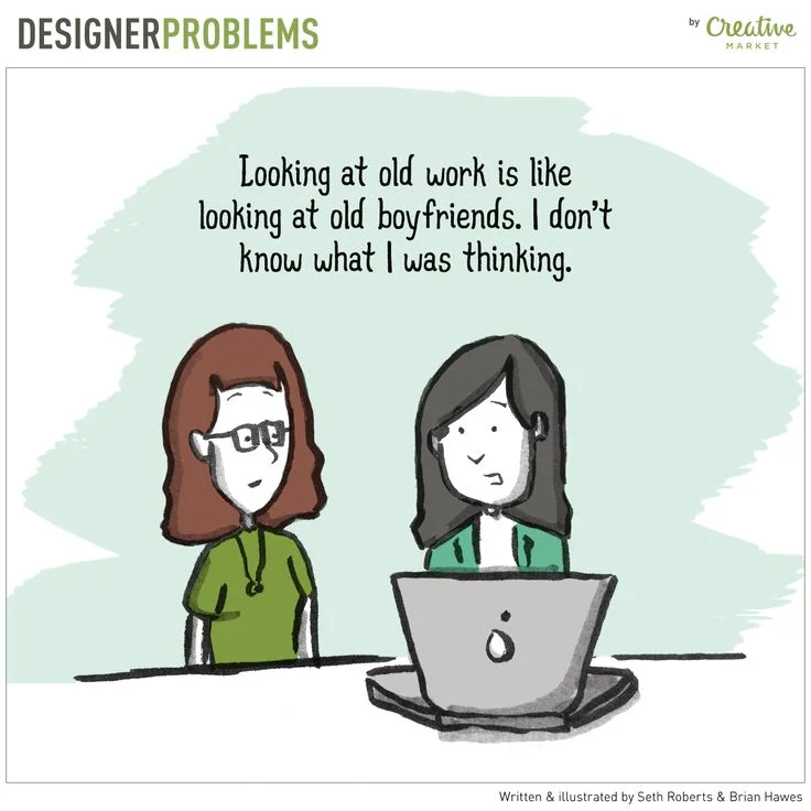
I've been weeding out old files as part of my new year purge, and came across my design notebook from 2008! It was nostalgic and hilarious and embarrassing.
I found dozens of website wireframes in there from my NYC freelancing days. This was when I was hand-coding websites and I was able to choose every aspect of the design down to the pixel. Now, most of my clients are running websites using themes and plugins. Instead of writing code from scratch, I spend more time tweaking Squarespace or Wordpress designs and troubleshooting plugin updates.
It got me thinking a lot about websites and how they're made now vs. 2008.
The drag-and-drop website world is a powerful and beautiful one. It gives small businesses the chance to create low-cost, eye-catching websites. But where have all the wireframes gone? Instead of starting from scratch with a pen & paper, many businesses are picking a pretty template and just filling in the content areas with no thought into their website's information hierarchy, how the user may interact with their site, or even what they want the visitor to do when they land on a page.
I've been sketching websites for 15 years, and I still sketch them out, even when I plan to use a template. There are a few reasons why a blank piece of paper (and someone to work with you) can be the perfect place to start.
Templates can be limiting
Website templates are like a coloring book. You fill in areas that have been created for you, with no real freedom of imagination. You quite often end up with a beautiful end result, but strategy and creativity were not central in your creation process. Compare that to starting with a blank piece of paper. You can create anything you want!
Think about who you want to visit your website, and what you'd like them to see first. Where do you want to draw their attention? How do you want to present your story before offering them an action? Once you have a basic wireframe, you can pick the template that best suits YOUR design, rather than tweaking your content to fit a template.
Content needs organization before color schemes
I spend a lot of time looking at navigation bars and mobile menus. Some of them are clear, well thought-out, and easy to navigate. Others... are not.
It's very easy in a website builder to just + Add New Page + Add New Page + Add New Page to your heart's content. Often that ends up in rambling navigation, fuzzy categories, and frustrated visitors.
If you have a website with a lot of rich, useful content and your navigation bar is stretching the limit, try the Post-it note approach. Write all the navigation items on Post-it notes and start moving them around. See what you can combine into one group. Can you change some of the navigation wording to make things more clear? Can you reduce your navigation text to one or two words?
Even drag-and-drop websites can be overwhelming
Many of my clients are half-way through building their own website or have created a website that doesn't seem to be working for them. I often hear, "It doesn't look like I want it to" or "I made a website but it's not making money" or the worst, "I pressed a button and it doesn't work anymore" (eek!).
If you plan to build your own website, consider hiring a designer to help you get started and be on call for issues. The most important part of web design comes before the site is created: the organization, the content, and the user experience. A designer will help you create a template with your end-user in mind, and that will pay off in conversions in the long-term.
Plus, if you run a small business or organization, chances are you have a lot of other things on your plate, and you may not want to spend your free time digging around in Wordpress to see why your revisions are not appearing in the right place. Having a designer on call will save you hours of troubleshooting, and you can get back to doing what you like to do!
I feel like I'm hitting that point in my career where I'm starting to be a little bit old-school. I remember being fresh out of college (when I was sketching in this notebook!) and meeting other designers who would try to slow down the design process. I worked at the same desk as a man who would groan, "let's think about this first" every time someone wanted a design turned around too quickly. Now I'm the designer taking a few steps back to think, organize, strategize, then move forward.
It was fun looking through my old designs and my portfolio of wireframes, print pieces, and press releases from 2008. Fun and uncomfortable, since they're all so dated now. Happy 10-year anniversary, wireframes! It was a pleasure seeing you again. Thank you for the perspective. No hard feelings, but it's time for the shredder. Time for my bullet journal to take over ;)


